Tropical Billboard
|
|
When tasked with the project to create a tropical billboard, my mind went straight to Mamma Mia. I am a huge Mamma Mia fan and since it is set in Greece, why not use it as inspiration? I initially found this image and altered the hue and saturation and added a warm filter to include a warmer orange and pink. I am very happy with the colours since it portrays a warm sunset that has a great contrast against the bright blue water. I also increased the exposure to allow more detail in the rocks to be seen. As for the text, I initially did a clipping mask of sea glass but sadly the colours did not go well together. Alternatively, I decided on silver sparkles which worked even better than I imagined. Once I was happy with the clipping mask, I adjusted the stroke, bevel, inner and outer glow as well as the inner shadow. For these details I chose blues related to the water and to my logo. As for the logo, I knew I wanted to incorporate one of the hotels in the movie. Hotel Bella Donna is from the second movie and I love that it has the island name underneath. The only trouble I had was deciding on which image to use for the clipping mask but once it was decided the placement turned out great. Overall I am very happy with the result of my billboard and I am happy I was able to challenge and better myself with my work.
|
Multiplicity
|
|
Despite being somewhat stumped in the beginning, I am extremely happy with the final image. This was a great learning experience to better my skills and further my knowledge. I put on mom jeans, a white turtle neck and my mom's leather jacket from when she was my age. I went out in the field behind my house and had my brother take pictures of me all around the field. Once I started editing, I was inspired by one of my favourite books, Miss Peregrine's Home for Peculiar Children. The book contains rather odd images that inspired the book. This concept led me to lowering the vibrance and saturation. In addition, when in Lightroom, I edited each image by decreasing the exposure, contrast, texture, clarity, white and black. I also increased the shadows and dehaze. It was very beneficial learning how to proper apply the clipping mask and to learn all of the specific steps. The only challenge I had was processing where I should place each layer but in the end it worked out. I think that I achieved the effect I was looking for and it is great when hard work pays off.
|
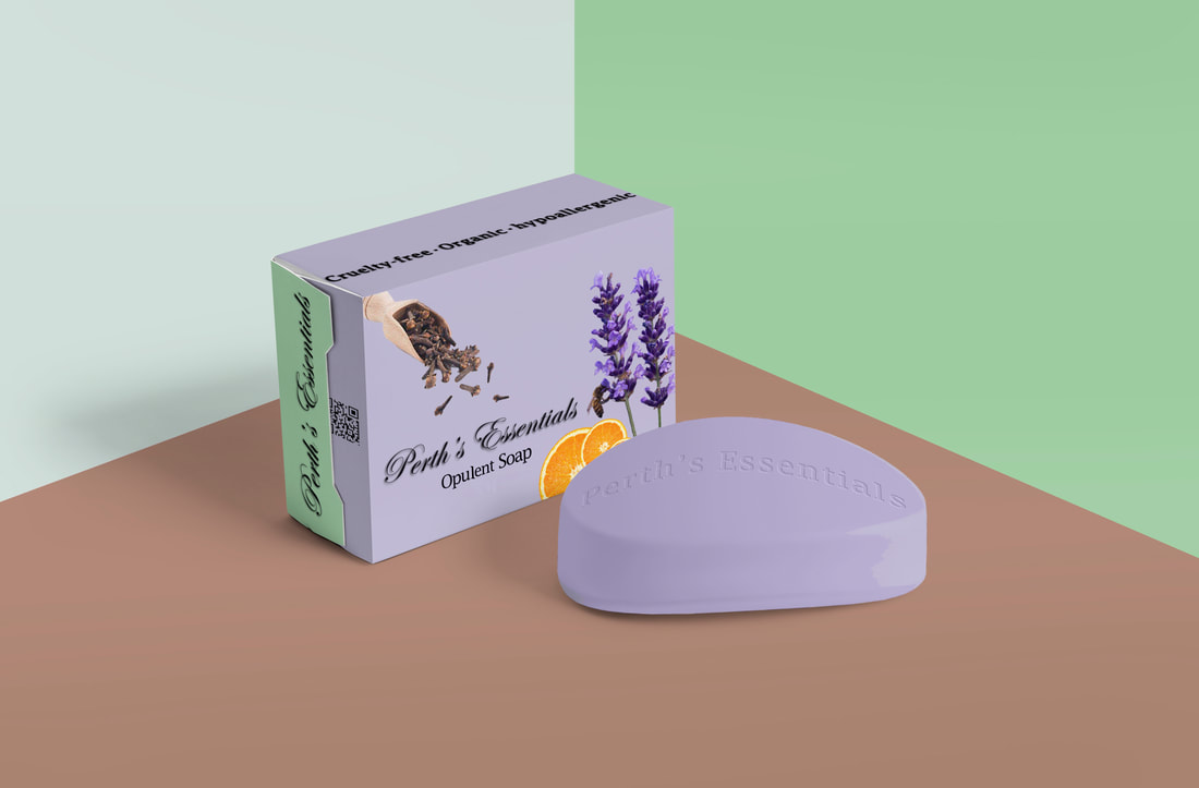
Sample Mock-Up
|
As an introduction to learning how to use mock-ups, I decided on bar soap. Recently I have been into essential oils and I used one of my favourites as my inspiration. The brand, Fabulous Frannie, has a roll-on made with sweet orange, ylang ylang and my personal favourite, clove. I also love the scent of lavender which played a major role in the colour scheme. As for the colour choices, I am currently liking the aesthetic of sage green and pale lavender together. When adding the image of cloves, I knew I wanted them to be falling onto the title so I edited them to produced a falling effect without actually touching the text. I love that there is a bee on the lavender but that does not allow the soap to be vegan, which in the end is okay. The addition of the oranges adds an aspect of brightness which turned out great. One of the biggest challenges of this project was choosing which mock-up to use. In the end, I found this one which works perfectly with my ideas. I am happy that I was able to edit the floor and walls because I love the colours together. As for the name of the brand, I have always loved the name Perth and it is a city in Australia that is beautiful. I choose the word opulent instead of luxurious because I wanted to make it more unique. Moreover, I am proud of how this turned out and I am very excited to expand my knowledge!
|
The world is better with you in it.
